Add a Transparent Background to Text and Buttons in Squarespace
Have you ever found the perfect banner image for your Squarespace website…only to realize your headline will barely show up on top?
Argh. That is so frustrating!
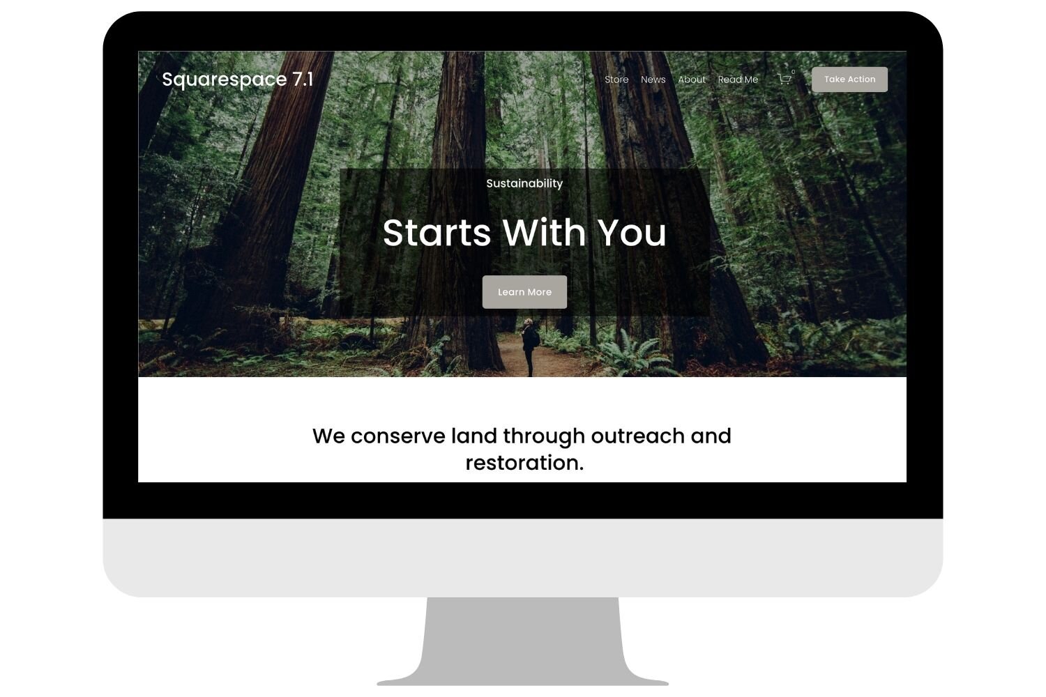
With busy backgrounds, it’s hard to make the text show up clearly. But what if you could just add a transparent background to your text? That way, your text will be easy to read and your beautiful banner image will still be visible.
Sample banner image with transparent background
In this video, I show you how to add a transparent block behind your text and buttons in Squarespace 7.0 and 7.1.
5 Steps to Add a Transparent Background With CSS
Use the CSS snippet below to add a transparent background behind any text or image block on your Squarespace website. Then follow the 5 steps below to customize it for your website design.
/* Background Colour */
#BLOCKID {
  background: rgba(0,0,0,0.6);
  padding-top: 1vw;
}
#BLOCKID {
  background: rgba(0,0,0,0.6);
  padding-bottom: 1vw;
}
First off, you will need to copy and paste the CSS snippet into your Squarespace website.
Next, you will need to find the block ID for your text and button blocks. You can do that easily with the Squarespace ID Finder Chrome Extension. Or, just follow the tutorial in the video to copy the page ID using Chrome Developer Tools.
Edit the RGBA code to match your preferred color. In this tutorial I use the color black, which has an RGBA code of (0, 0, 0). But you can replace this with the RGBA code of any of your other brand colors. (Click here to learn more about RGBA color codes.)
Once you pick your color, you can edit the transparency. The transparency is determined by the last number in the color code. For example, (0, 0, 0, 0) would mean your shape is completely transparent. Whereas, (0, 0, 0, 0.5) means it would be 50% transparent. And (0, 0, 0, 1) would result in a solid black shape.
Finally, edit the padding to add more space between your text or button and the edge of the transparent background. For example, in the image below, the transparent background barely extends above and below the text. To fix this, I can add some padding above and below. In the CSS snippets above I have the top and bottom padding set to 1vw (viewport width), but you can increase the padding to get the look you want.
How to Edit the Background Width
In some cases, your transparent background might be far wider than you want it to be. If that’s the case, it is simply because the block is too wide. You can fix this by adding spacers on either side of the block with the transparent background. Or, you can use the default Squarespace settings and change the content width.
If you are using the new Fluid Engine editor, then editing the width is no problem! Fluid Engine makes it easy to change the width of any block in a section, simply by dragging the border to widen or narrow it.
Armed with a transparent background, you can now add busy images to your Squarespace website and place text on top without worrying that your text is too hard to read.


