Add a Mobile Friendly Table in Squarespace
What does this code do?
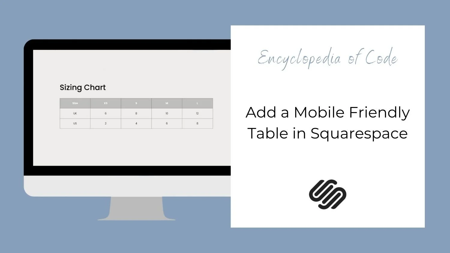
This code snippet will allow you to add a table in Squarespace. This can be helpful for displaying a chart such as a Sizing Guide.
Note: This table is mobile responsive. Each row in the table will become its own chart on mobile.

Video Tutorial
Code Snippets
HTML
Copy and paste this code into a Code Block on your page.
<div class="custom-table">
  CODE GOES HERE
</div>
Then go to the HTML Table Generator to create your table code. When you have it how you like, make sure “do not generate CSS” is checked and copy and paste the code into the Code Block instead of CODE GOES HERE.
Javascript
Copy and paste this code into Settings > Advanced > Code Injection > Footer
<!-- Mobile Friendly Table -->
<script>
(function () {
  var customTable = document.querySelectorAll(".custom-table");
  customTable.forEach(function (e) {
    var columns = e.querySelectorAll("tr");
    columns.forEach((tr) => {
      var rows = tr.querySelectorAll("td");
      var titles = e.querySelectorAll("thead th");
      for (i = 0; i < rows.length; i++) {
        var labels = titles[i].innerHTML;
        rows[i].setAttribute("label", labels);
      }
    });
  });
})();
</script>
CSS
Copy and paste this code into Design > Custom CSS
/* Mobile Friendly Table */
.custom-table table {
  width: 100%;
  table-layout: fixed;
  tr,
  td,
  th {
    padding: 1vw;
    text-align: center;
    border: 1px solid rgba(0,0,0,0.4);
  }
  thead {
    background-color: rgba(0,0,0,0.2);
    color: white;
  }
}
@media screen and (max-width: 640px) {
  .custom-table thead {
    display: none;
  }
  .custom-table tr {
    margin-bottom: 8px !important;
    display: block;
    border: none !important;
  }
  .custom-table td {
    display: flex;
  }
  .custom-table td::before {
    content: attr(label);
    font-weight: bold;
    width: 50%;
    text-align: left;
    padding-left: 10px;
  }
}
Then edit the colors and sizes. Make sure to check both Desktop and Mobile.
How To Use It
Copy and paste the code as indicated above.
Then edit the colors and sizes. Make sure to check both Desktop and Mobile.
You can use a word, rgb, or hex code for the color.