Create a Timeline in Squarespace
What does this code do?
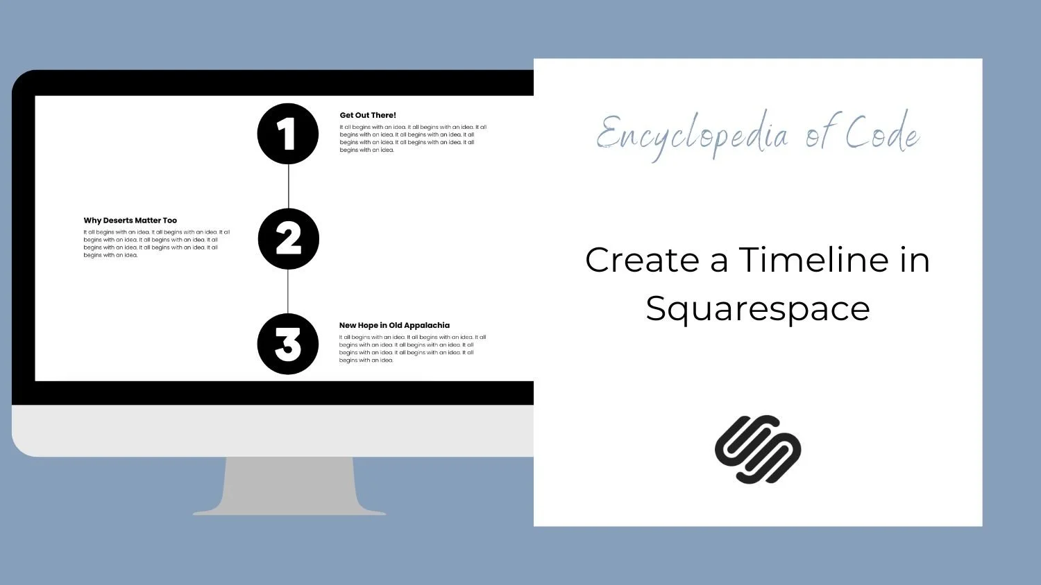
This code snippet will use a Summary Block to create a timeline in Squarespace.

Video Tutorial
First, add the content.
Your first step is to add the content of your timeline into a blog with each post being a step in the timeline. Then add a summary block onto the page you would like the timeline on. Be sure to choose a list set up and turn the title, excerpt, and featured image on.
Option #1: Basic List
Copy and paste this code into Design > Custom CSS
/* Timeline */
.sqs-gallery-design-list {
  pointer-events: none; //turn off the click through link
}
.sqs-gallery-design-list .summary-item:not(:last-child) .summary-content {
  border-left: 2px solid black;
}
.sqs-gallery-design-list .summary-content {
  margin-left: -7.4%; // position of the line
  padding-top: 1.5vw; // spacing above the text
  padding-bottom: 10vw; //spacing between items
  padding-left: 10vw; //spacing between image and text
}
.sqs-gallery-design-list .sqs-gallery-image-container {
  padding-right: 0;
}
.sqs-block-summary-v2 .summary-block-setting-design-list .summary-item {
  margin-bottom: 0 !important;
  padding-bottom: 0 !important;
}
.sqs-gallery-design-list .summary-title-link {
  font-weight: 700; // bold the title
}
.sqs-gallery-design-list .summary-excerpt p {
  font-size: 1rem; // font size of the excerpt
}

// Timeline on Mobile
@media screen and (max-width: 640px) {
  .summary-block-setting-design-list .summary-thumbnail-container,
  .sqs-block-summary-v2
    .summary-block-setting-design-list
    .summary-thumbnail-outer-container {
    width: 20% !important; //width of image
  }
  .sqs-gallery-design-list
    .sqs-gallery-design-list-slide:not(.no-image)
    .sqs-gallery-meta-container {
    width: 80% !important; //width of text
  }
  .sqs-gallery-design-list .summary-content {
    margin-left: -10%; // position of the line
    padding-bottom: 10vw; //spacing between items
    padding-left: 15vw; //spacing between image and text
  }
}
Option #2: Alternating List
Copy and paste this code into Design > Custom CSS
/* Timeline */
.sqs-gallery-design-list {
  pointer-events: none; //turn off the click through link
}
.sqs-gallery-design-list
  .summary-item:not(:last-child):nth-of-type(2n-1)
  .summary-content {
  border-left: 2px solid black;
}
.sqs-gallery-design-list .summary-item:nth-of-type(2n-1) .summary-content {
  margin-left: -7.4%; // position of the line
  padding-left: 10vw; //spacing between image and text
}
.sqs-gallery-design-list .summary-content {
  width: 50% !important;

  padding-top: 1.5vw; // spacing above the text
  padding-bottom: 10vw; //spacing between items
}
.sqs-gallery-design-list .sqs-gallery-image-container {
  padding-right: 0;
}
.sqs-block-summary-v2 .summary-block-setting-design-list .summary-item {
  margin-bottom: 0 !important;
  padding-bottom: 0 !important;
}
.sqs-gallery-design-list .summary-title-link {
  font-weight: 700; // bold the title
}
.sqs-gallery-design-list .summary-excerpt p {
  font-size: 1rem; // font size of the excerpt
}
/* Timeline on Desktop */
@media screen and (min-width: 640px) {
  .sqs-gallery-design-list .summary-item:nth-of-type(2n-1) {
    display: flex;
    justify-content: flex-end;
  }
  .sqs-gallery-design-list .summary-item:nth-of-type(2n) {
    display: flex;
    flex-direction: row-reverse;
    justify-content: flex-end;
  }
  .sqs-gallery-design-list
    .summary-item:not(:last-child):nth-of-type(2n)
    .summary-content {
    border-right: 2px solid black;
  }
  .sqs-gallery-design-list .summary-item:nth-of-type(2n) .summary-content {
    margin-right: -7.4%; // position of the line
    padding-right: 10vw; //spacing between image and text
  }
}
/* Timeline on Mobile */
@media screen and (max-width: 640px) {
  .summary-block-setting-design-list .summary-thumbnail-container,
  .sqs-block-summary-v2
    .summary-block-setting-design-list
    .summary-thumbnail-outer-container {
    width: 20% !important; //width of image
  }
  .sqs-gallery-design-list
    .sqs-gallery-design-list-slide:not(.no-image)
    .sqs-gallery-meta-container {
    width: 80% !important; //width of text
  }
  .sqs-gallery-design-list .summary-item:not(:last-child) .summary-content {
    border-left: 2px solid black;
  }
  .sqs-gallery-design-list .summary-item .summary-content {
    margin-left: -10% !important; // position of the line
    padding-left: 15vw !important; //spacing between image and text
  }
}
How To Use It
Copy and paste the code as indicated above.
Edit the spacing and colors.
To learn how to find a collection id, page id, or block id check out our Start Here guide.