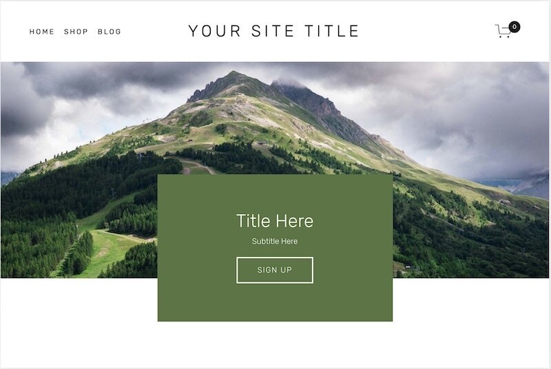
Text Box Overlaps Two Sections
What does this technique do?
This creative workaround will allow you to create the illusion that you have a coloured text box overlapping two sections.
Code Snippets
This effect does not actually require any code by rather a creative use of background images.
Create a background image so that the bottom or top of the image matches the section above or below. In the design above, the background image is the mountain scene with a white bottom. I created this using Canva.com. The original file is 2000px by 1500px and the mountain image is 900px tall, leaving the remaining 600px as white space. You will probably need to play with these numbers to get the effect that you would like. Make sure you compress the background image so that the file is no larger than 500KB or it will slow down your website.
Create a background for your text box. In the design above, this is just a green rectangle. I created this using Canva.com by creating a file that was 800px by 500px and then made the background green. Again, make sure you compress the image so that the file is no larger than 500KB or it will slow down your website.
I then uploaded the mountain image as a banner or background image and adjusted the white circle to select where I wanted the image to focus. You may need to play with this setting to get the effect that you would like.
Finally I added some spacer blocks and a poster image block. I uploaded the green image to the poster image block and put my text inside.
